#rebranding
Primotly: The Story Behind Our Rebranding
11/05/2022
There are several reasons why companies with many years of experience decide to rebrand their business. In our case, it was part of the development strategy. We made a very thoughtful decision preceded by an in-depth market analysis. After a few months of intensive work, we are sure today that it was a good move. And since you came to this article, maybe you are wondering what has changed since we have become Primotly? Are you fascinated by nuances related to the name, graphic elements, font and colours? Or maybe you are considering rebranding your business yourself, but you don't know where to start? Then, you've come to the right place! Here is a story about what has changed (and why) when bPol became Primotly.
It is worth explaining to those who are entirely new here that we have operated as bPol over the last 16 years. Throughout this time, we listened to the voice of our clients very thoroughly, watched the market carefully and gradually increased along with the implementation of projects around the world. Rebranding is not actually a new beginning but a kind of evolution, a consequence of consistent actions. So let's start with the main reasons why we decided to make some changes.
And by the way, look to the left. A wholly new website includes entirely new interactive elements such as a table of contents. So if you want to jump to a specific part of the text, just click.
What is rebranding for?
Branding creates the brand's identity, distinguishing it from the competition. It makes customer acquisition easier and also determines expectations. So, why are we changing something that has built a decent image of the brand for years? Different businesses have different reasons. Sometimes fashion and trends are enough. Graphic identity becomes outdated over time, and the newly created competitive brands look "fresher" only because their logos and typography are simply more current. The needs of customers are also changing dynamically. Rebranding can therefore be an opening to new target groups but also a way to give a signal that the brand has specialised in some fields. Nowadays, companies are quickly evolving, and the original identity can sometimes be a limitation inhibiting development in a new direction. It also happens that rebranding results from a change in the company's leadership, Merge and Acquisition or internationalisation. There are also sad cases of rebranding resulting from poor brand reputation. Fortunately, the last of these reasons does not concern us.
Concerning our rebranding, we were guided by 4 main assumptions:
- emphasise our superpowers,
- indicate what we are doing,
- focus on a specific niche,
- be more visible.
In-depth analyses, market research and conversations with clients have convinced us that rebranding will allow us to better position ourselves in the market, influencing the achievement of goals, global growth and establishing new business relationships.
We have reduced the range of services to the 2 most important: Building Products and Extended Team. In communication, we also emphasise the main technologies on which we focus: Symfony and React. Focusing on a specific niche is part of our development strategy. Unlike the previous name, the name Primotly allows customers to identify our position on the market more easily. What's more, the new logo and concept behind the visual identity emphasise the key message, about which you can read about in subsequent paragraphs.
Why Primotly?
Before we get to the concept that stands behind our visual identity, let's start with the name. The suffix "ly" added to adjectives creates adverbs that indicate the manner or nature of something. With nouns, it creates adjectives describing something typical of a given thing. In this way, hundreds of names for businesses were created in the world of technology startups. As for Primotly, this is more like a side effect of another word game (however, it cannot be hidden that thanks to the fashion for various "ly" and "fy '' our name is even more associated with modern technologies). Then what is our secret? The name Primotly was created from a combination of 2 words that perfectly describe the features of our brand. We help startups, enterprises and investors by providing PRIME software engineers – pre-vetted and available REMOTELY. And voilà! When the word "Primotly" appeared during one of the many brainstorming and naming sessions, something clicked, and we immediately knew that this was it.
Visual representation of values
The next two key values are emphasised by subtle graphic elements that appear on the website, in promotional materials and the logo. The metaphor of the missing molecule in the chemical equation and characteristic arrows symbolising business scaling and expanding the scope of cooperation add another level of meanings, associations and references. All this, of course, positively contributes to appropriate positioning on the market and distinguishing from the competition.
The entire Primotly identity system combines two main associations: Extended Team (a service involving the extension of the team working as part of a given project) and chemistry (a missing element). The arrows symbolise the expansion, while single and two-letter shorts refer to the periodic table of the chemical elements.
Extended team, extended possibilities

The first element of this rebranding visual puzzle communicates to recipients that the company offers the "Extended Team" service. How does it work, e.g. on the website? The basic elements creating and determining the composition are the logo and the arrows appearing in it. On their basis, other fields are created, separated by clear frames. Inside them, depending on our needs, we can put photos, texts and shorts. You can read more about the latter in the next paragraph dedicated to... chemistry.
Missing element in the equation

Another component of our concept is a reference to chemistry. This metaphor indicates the missing element in the equation, which in our case are the best REACT and SYMFONY developers in the industry. When the appropriate competencies are missing, they can join the client's project at any time and influence the final shape of a digital product. And here comes the second layer of chemical metaphor. To get the final product, there must be a chemical reaction. And because one of the 2 technologies in which we specialise is REACT, the chosen solution gains even more legitimacy. In practice, our chemical references are simply subtle visual accents associated with the board created by Mendeleev. The concept is based on combining backgrounds of various shades/colours and then the arrangement of individual elements in the appropriate hierarchy. Highly distinguished and large abbreviations, descriptions that explain them, and other elements in the form of a logo, photos etc., are immediately striking here.
About new logo
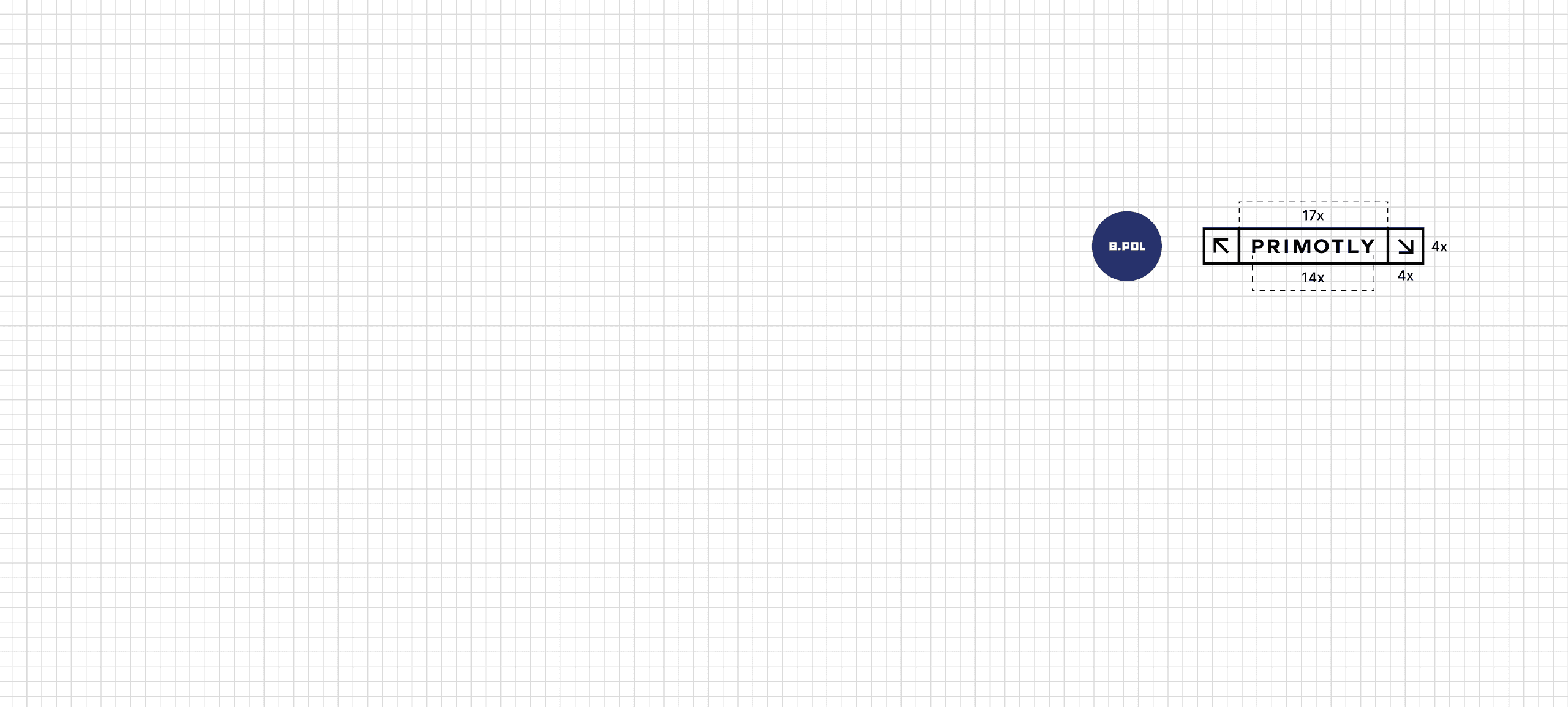
The main characteristic feature of the Primotly logo is simplicity. The sign is based on three elements that give it a minimalist form:
- two arrows,
- brand name,
- frames inside which these elements were closed.
The proportions of the sign were based on the mesh in such a way that all distances and intervals are full. In its basic version, the logo closes in the form of a 25 x 4 rectangle. Modular structure was used to make the sign as functional as possible.

The only limitation we need to pay attention to when creating an alternative version of the sign is the direction indicated by the arrows. It is about the behaviour of semantics related to expanding. The arrow directed towards the upper-left corner must always be equally or higher than the arrow directed to the opposite direction. Below you can see examples of logotype variants.

Three shades of blue
The color palette we use is based on black, red, white and three shades of blue. Primary colours do not have to be dominant. The choice of them depends on the design. The biggest challenge for the designer is to skillfully combine them.

If the graphics have a white background, it is allowed to use elements in each of the listed colors. It looks slightly different when we change the background. The key and basic factor is readability, and it determines the way the colours of the elements should be selected. Similar rules also apply to logo colours. It is allowed to use various variants, but in this case, it is also necessary to choose only the most readable combinations.


Fonts and typographic styles
Typography is a strong part of the semantics described earlier. Below you can see examples of elements using chemical symbols, characteristic headlines with distinctions, descriptions or square brackets:

Typography used in Primotly branding is based on 2 fonts: Graphie Bold (from the Adobe Creative Cloud library) and 6 styles of Jost. Let's start with the first one. It was Graphie Bold to create a logo. The name was written in capital letters, and the distance between the letters was manually selected to the rest of the sign. This style is not used in any other brand identity elements.

All texts are written with the modern serif font – Jost. We use 6 weight varieties. An additional option is the Italic variant for every weight. Importantly, when creating graphic materials, we avoid the Black option, which is too heavy.

The icing on the cake: layout
The last branding component is something that you can't see at first glance. It's the basic mesh determining the layout of graphic matters. The task of the prepared layout is to facilitate the work of the designer. Meshes can be combined and used in both vertical and horizontal systems. It is important that the elements found on the graphics maintain hierarchy and harmony. In our case, it has 8 columns, and a fixed size: 1920 x 1080 px. Padding is 50 px. The columns have a width of 210 px and are separated by a 20 px width break. Meshes with fewer columns can be used for other formats, but should still be based on the basic mesh.
Congratulations, you just finished reading a complete guide to all the elements of our visual identity. A case study describing the rebranding process is a great way to welcome you to our new website and blog. We hope that the article will also be useful for those who want to change or refresh the image of their business and need a bit of inspiration. We would also like to thank FORMATYW for their help and great involvement in the creation of our brand book. Goodbye bPol, hello Primotly!
Di

Diana Kolopenyuk
Business Developer
Rebranding is part of our development strategy focused on the opportunities we offer and better recognition among clients. We believe that the new visual identity will emphasize our strengths even better and that we are a trustworthy partner. The name "Primotly" definitely better represents who we are.Related Articles
Primotly is a trading name of bPolNet Sp. z o.o.,
ul. Człuchowska 9/6 01-360 Warszawa, Poland
PL5223071494
365402632
0000636383

